Brand Guidelines
The following guide includes the core elements of the ZwillGen brand, including download links for our logos and fonts, values for our brand colors, and use case examples.
The ZwillGen logo is important to us — it’s the primary visual element that signifies who we are. In order for it to be instantly recognizable, it’s important to maintain a certain level of consistency. When using our logo, please do not edit, change, distort, recolor, or reconfigure it. Let this guide serve as a baseline for how to use our logo across any medium.
Logo Elements
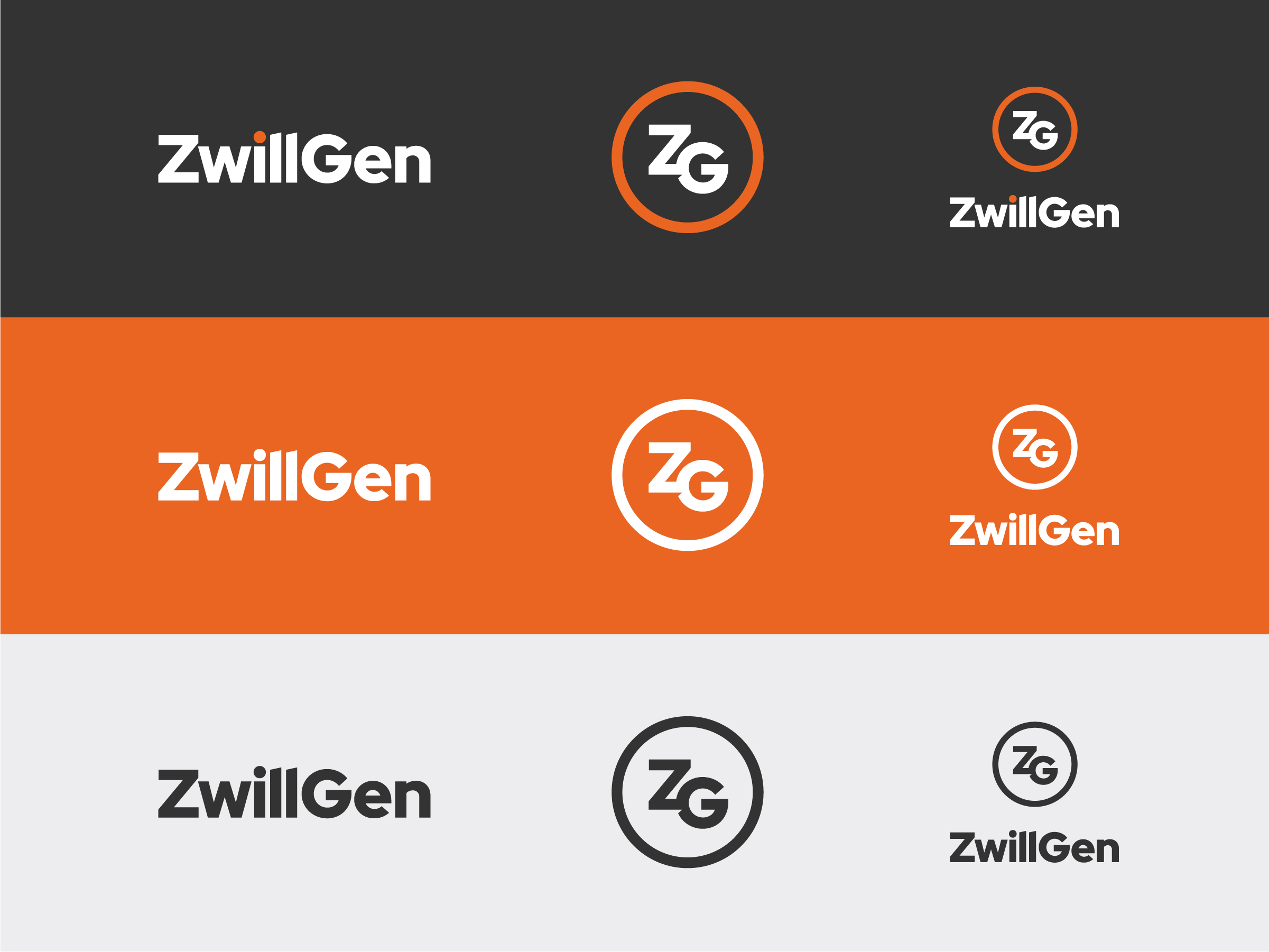
The ZwillGen logo is made of two distinguishing marks — a wordmark and monogram. Because logos need to perform well across various sizes and media types, our logo comes in different orientations that can be used as needed depending on background colors and the space available.
Stacked Logo
Wordmark
Logo in Use
Our logo and accompanying marks can be downloaded in a variety of colors in the section above. Below are some acceptable examples of the logo in use.
Much like our logo, color is another important element that signifies who we are as a company. In addition to black and white, below are our primary colors.
Primary Brand Colors
Orange

RGB – 242, 101, 34
CMYK – 0, 74, 99, 0
HEX – #F26522
Orange Shade

RGB – 210, 87, 28
CMYK – 13, 79, 100, 3
HEX – #D2571C
Charcoal

RGB – 51, 51, 51
CMYK – 69, 63, 62, 58
HEX – #333333
Lunar White

RGB – 245, 245, 247
CMYK – 1, 1, 0, 3
HEX – #F5F5F7
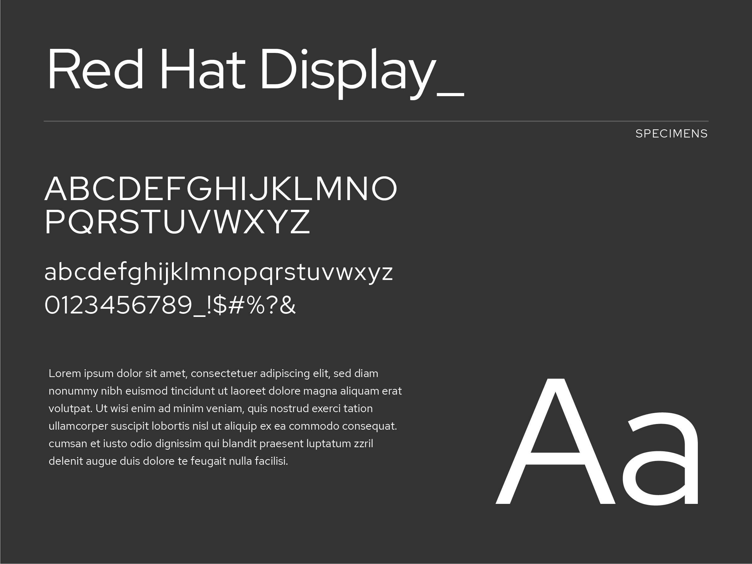
The final piece of the puzzle making up the ZwillGen brand is our font. For simplicity and clarity, we use only one font family — Red Hat (Display & Text).
Red Hat Display & Red Hat Text (Google Fonts)
With versions suitable for both headlines and body copy, Red Hat is a geometric sans serif that performs well at a variety of sizes and applications. Chosen for it’s technical characteristic (geometric letter forms) and it’s subtly playful nature, Red Hat resonates perfectly with who we are as a company. Both fonts can be downloaded for free through Google Fonts using the links below.
Note that while Red Hat is preferred, there may be instances where its use is not feasible (for example, if you are sharing a document or slide deck with someone who may not have the font installed). In such cases, it is acceptable to use Arial instead.
Hierarchy Examples
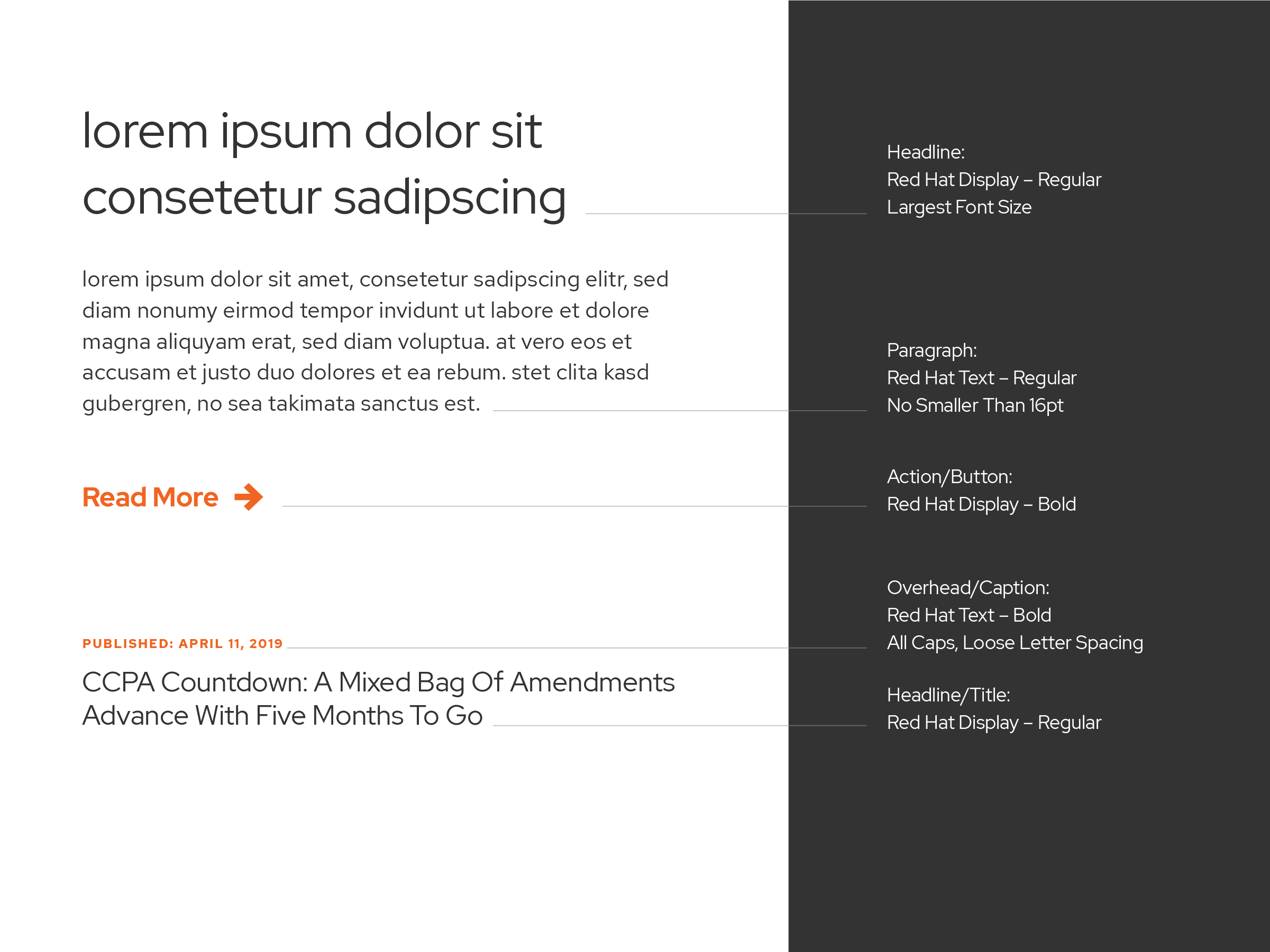
In our industry, communication is important. How we display information is just as important as what we communicate. Use these examples guides for maintaining clean and clear typographic hierarchy.
Limit the use of Red Hat Display for large text sizes such as headlines and titles, while using Red Hat Text for most long format content and smaller captions.
Typography Use with Imagery
When using text over an image, use charcoal text on light imagery or white text on dark imagery. When displayed near the logo, be sure to use the same color text and logo. It is acceptable to use two color versions of the logo.
Light Image

Dark Image

